
From 10 Ideas to One: How We Chose What to Build for Ship-a-ton 2026
 on
on At BerylCode, we wanted Ship-a-ton to be more than just another hackathon project. We saw it as an opportunity to publicly document how we work: identifying a problem, forming hypotheses, researching, designing, building, monetizing, launching, measuring, and iterating.
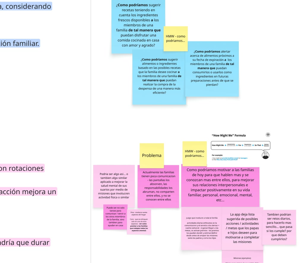
Exploring challenges through ideation to uncover meaningful solutions.
Coming up with ideas wasn’t the hard part. After our initial exploration, we already had around 10 very different directions we could pursue. The real challenge was deciding which problem was worth spending the next few weeks researching, designing, building, testing, monetizing, and ultimately putting in front of real users.
What We Thought
Some ideas were simply more exciting to us. Others had stronger visual potential. Some seemed easier to monetize. A few felt especially well suited to a hackathon because they could make a strong first impression. But “we like this idea” wasn’t a good enough reason to build it.
So we started asking more practical questions:
- How often does this problem actually happen?
- Can we build a useful MVP within the time we have?
- Can someone understand the product in 30–60 seconds?
- Is there a natural reason to come back?
- Can we monetize it without compromising the experience?
- Is there room to approach the problem differently?
- Does the project give us enough space to demonstrate BerylCode’s capabilities across research, UX, visual design, and engineering?
That led to our first evaluation framework.
We compared the ideas across factors such as usage frequency, MVP feasibility, growth and sharing potential, visual potential, monetization, differentiation, and fit with Ship-a-ton.
The goal wasn’t to create a perfect scoring system. It was to make our assumptions visible.
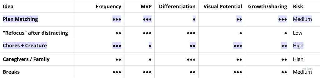
Comparing and prioritizing ideas.
Two of the ideas we were most excited about stood out very differently once we assessed their feasibility and risk.
What We Found
Competition doesn’t automatically make an idea less interesting.
During our desk research and benchmarking, we found that nine of our ten ideas already had some form of direct or indirect competition. At first, that felt like a warning sign. But instead of stopping there, we tried to look at it from a different angle. We started asking a more useful question:
What are these products already solving well, and what are they still not solving properly?
When we explored the "space around breaks" idea and "everyday well-being" idea, we noticed that existing products often follow very different approaches: some focus on minimal reminders, others guide users through specific activities, some rely on characters, progression, or gamification.
This variety was more insightful than simply counting competitors, because it showed that a “crowded” category is not necessarily a homogeneous one.
At first, we also assumed that more frequent problems would be safer bets than occasional ones, and that highly visual or gamified ideas might perform better in a competition where products need to be understood quickly. We even briefly treated competition itself as a reason to be cautious. But that assumption didn’t hold for long: instead of asking, “Does this already exist?”, we started asking:
- “What is this market already doing well, and what still feels unclear, generic, or not fully solved?”
- “What risks or opportunities can we realistically explore within a few weeks?”
This change in perspective made the comparison much more grounded and useful.
What We Changed
We stopped evaluating ideas only by how attractive they sounded and started thinking more seriously about what kind of product each idea could actually become. That’s when one problem started to stand out.
We kept coming back to people who spend long stretches of time focused, sitting down, or looking at a screen—and then reach the end of a work block, or even the end of the day, realizing they barely changed position, rested their eyes, or stepped away from what they were doing.
The initial solution was still very rough. We were exploring ideas around very short breaks, a creature or companion that could react to whether those breaks happened, and an experience designed primarily for people with sedentary, highly focused workdays.
We didn’t know yet whether any of those ideas were right, but we finally had something more valuable than a feature concept: a specific problem we could investigate.
Why This Idea Survived
It wasn’t necessarily the most viral idea. It wasn’t the easiest to build either. But it brought together several things we found interesting:
- a common and recognizable problem;
- a small, understandable core loop;
- value even for a single user;
- room to explore interaction and visual design;
- a real product challenge around notifications and retention;
- potential paths to monetization;
- and enough uncertainty for research to genuinely influence what we built.
It also gave us a chance to show several parts of the BerylCode process within a single project:
research → product framing → UX → visual design → engineering → monetization → analytics → iteration
That combination made it a strong candidate.
What We Still Didn’t Know
Choosing a problem doesn’t mean you’ve chosen the product. We still had plenty of open questions:
- How long should a break be?
- Should there be different types of breaks?
- How important should the companion be?
- Should the app stay almost invisible, or have a stronger personality?
- How much should the system decide?
- How much should the user configure?
- What makes a reminder useful instead of annoying?
And there was a more important question underneath all of them:
Were we describing a real problem the way users actually experienced it, or were we simply projecting our own assumptions onto it?
That was the part we needed to test next.
What We Tested Next
The next step was to get outside our own assumptions and start talking to people. We designed our research around questions such as:
- How much time do people spend sitting or moving very little?
- What prevents them from taking breaks?
- What do they naturally do when they do step away?
- What makes a reminder feel annoying?
- How much control do they want over the experience?
- What kinds of breaks realistically fit into a normal workday?
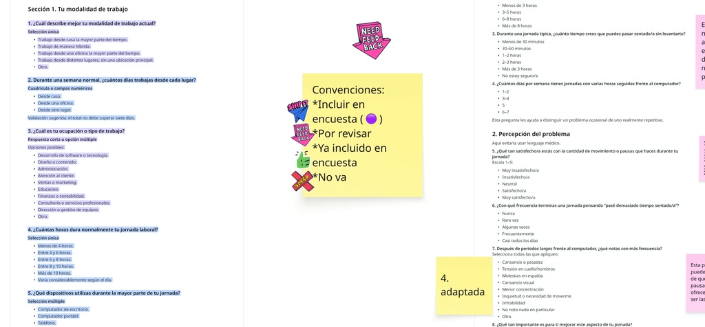
Analyzing the possible questions to create our survey
In the next Build Log, we’ll share what happened when we started talking to real people—and which parts of our original story actually survived contact with reality. Stay tuned!