
Ship-a-ton 2026: Build Log #3 - Finding BRBito’s Voice and Personality
 on
on After running our survey and taking a closer look at what already existed in the market, one thing became clear: if we wanted our product to feel different, a nice-looking interface wouldn’t be enough. We had to define its identity.
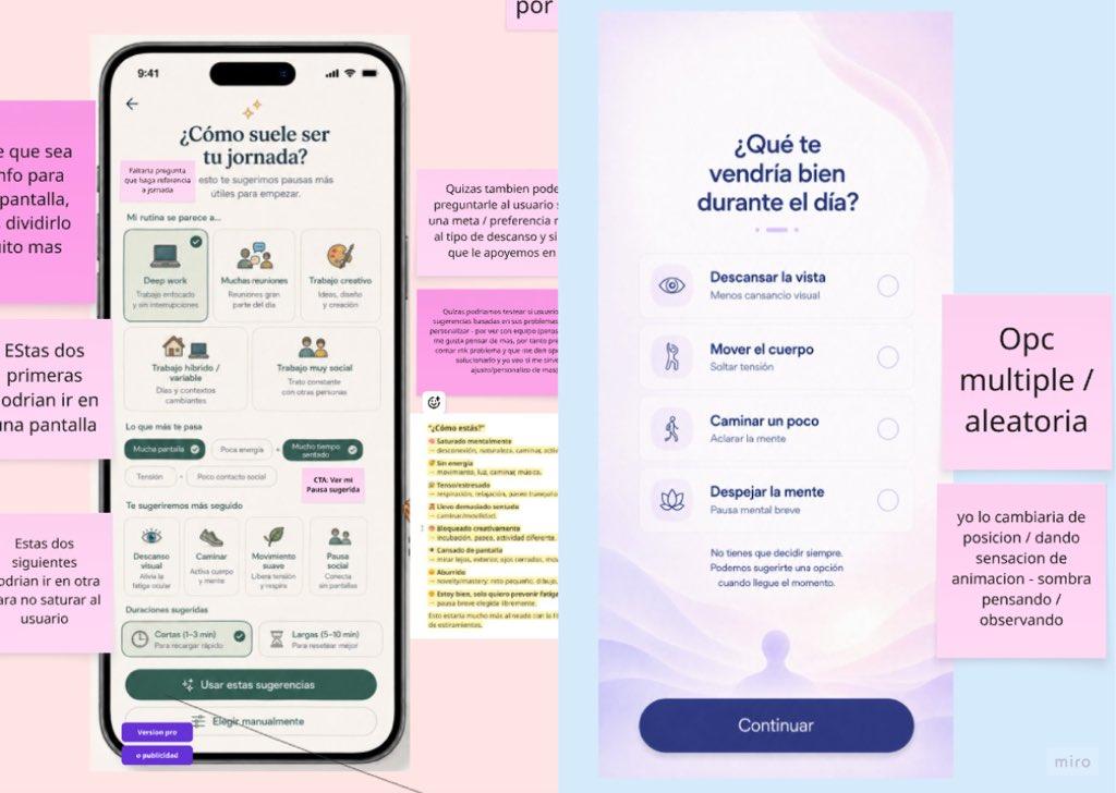
Visual explorations to define how much BRBito should do and show.
So before deciding what BRBito should look like, we ran into a pretty basic tension: How much should it do, and how much should it show?
On one side, we explored a more maximalist direction: more customization, more visual detail, more elements on screen, and more ways to interact. It was appealing because it had the potential to make the product feel more memorable.
On the other side, we explored a much simpler direction: fewer elements, fewer decisions, less visible content, and an almost utility-like experience. That felt more aligned with an app that, in theory, wants to ask for less of your attention, not more.
In the end, we realized we probably didn’t have to choose one extreme or the other. BRBito’s identity couldn’t live only in its colors, character, or illustrations. It also had to show up in the language, in the way the app interrupts, in how it invites someone to take a break, in how it responds when someone can’t stop, and even in how every message is translated.
First: the visual direction
From the beginning, we wanted to explore an aesthetic inspired by pixel art. We personally like that style, and we felt it could give BRBito a stronger personality in a space where many wellbeing, productivity, and reminder tools can start to look very similar.
At the same time, based on what we had already learned, we didn’t want BRBito to feel like a video game, a children’s app, a virtual pet that constantly needs attention, or an overly stimulating visual experience for a product that is supposed to help people slow down a little.
So we decided to keep the main interface contemporary, simple, and easy to read, while using pixel art in more emotional moments: BRBito itself, small environments, different states, transitions, and break moments.
Content as a key part of personality and differentiation
While working on the screens, we started noticing something important:
We could have the right character, the right colors, and the right illustration style, but if the copy said things like: “You need to take a break” or “Great job, you completed your break” the experience would still feel like any other habit-tracking app. We wanted BRBito to feel more like a calm friend who might say: “Would a change of pace help right now?” but who can also accept a simple: “Not now” without making the user feel punished, guilty, or worried about losing a streak.
That changed the way we started writing, and pushed us to think much more intentionally about UX writing, voice, tone, and style. Eventually, we landed on one rule that became useful across many screens:
- Before the break, BRBito invites.
- During the break, BRBito guides.
- After the break, BRBito lets go.
That means that before a break, it makes sense to explain or suggest.
During the break, the content should help answer the kinds of questions that might come up while doing the activity.
And once the break is over, we want the user to be able to choose whether to keep pausing or simply go back to their day.
More broadly, we wanted the value of the product to live not only in what it does, but in how the whole experience feels.
Finding the name — and the personality around it
From the beginning, we wanted the app to work in both Spanish and English so more people could use it. We explored many directions while looking for the right name. A lot of options related to words like “pause,” “break,” “rest,” “move,” or “reset” were already taken, too generic, potentially difficult from a legal point of view, or pushed us toward a category we didn’t fully want to belong to.
Then, while looking at the behavior itself, one idea stood out: When someone takes a short break during the day, what they are often really saying is:
BRB (be right back): I’m stepping away for a moment, I’m changing pace, and then I’m coming back.
That’s where BRBito came from. We liked it because it doesn’t literally describe a feature. It describes the moment, and has given us room to build a personality around the product.
When it came to content and localization, we also knew that translating the interface couldn’t simply mean translating each sentence word for word. “Pausas a tu ritmo” can become “Breaks at your pace,” and that works pretty well. But not every choice is that straightforward.
Some phrases sound natural in Spanish but stiff in English. Some words we use casually in Colombia can feel too regional for other users. We also considered using a little Spanglish with words like “back,” “reset,” or “mood,” because that could become part of BRBito’s personality.
But even if Spanglish can add some personality, it should never make an important instruction less clear — especially around permissions, privacy, notifications, settings, or break instructions: That’s where clarity comes first.
Visual design + content + localization
At first, we treated these almost like three separate tasks:
Design the interface, companions, and break experiences.
Write the right content for each moment.
And translate the app so it felt natural and easy to understand for both native and non-native speakers.
But during the process, we realized that all three are a fundamental part of BRBito’s identity. That identity starts to show up when:
- the character feels calm;
- the reminder doesn’t feel like an alarm;
- the copy gives you permission to say no;
- breaks don’t feel like another task to complete;
- and the translation keeps the same intention and simplicity.
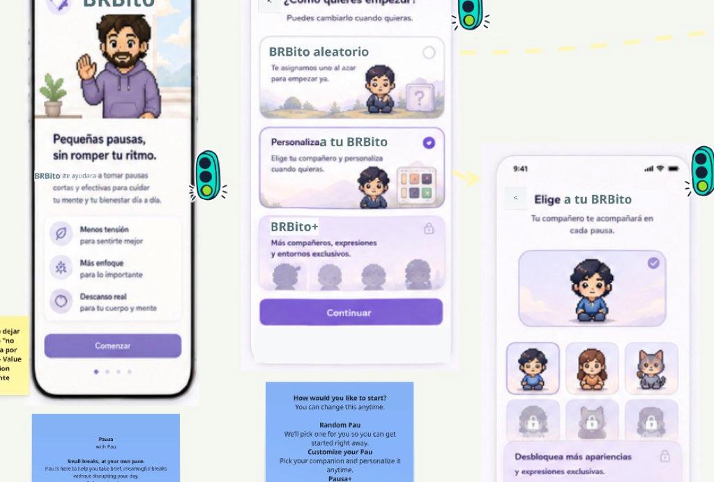
Exploring BRBito screens designed to accompany users.
On their own, none of those decisions are especially revolutionary. Together, they start to create a different kind of experience.
A few rules we’re taking from this stage
By the end of this exploration, we had a few fairly concrete principles:
- BRBito suggests. The user decides.
- Users can skip breaks without feeling guilty.
- We don’t want to turn rest into performance.
- The companion is there for you, but doesn’t demand attention.
- Pixel art adds personality, but doesn’t need to appear everywhere.
- Less text during the break.
- Less celebration when the break ends.
- The tone can be playful, but instructions need to stay clear.
- Spanish and English should be designed, not just translated.
And probably the most important one: Differentiation doesn’t always have to come from one big new feature. Sometimes it comes from many small, intentional decisions working together.
Coming next…
With the identity, tone, and first version of the product much more defined, the next challenge was much less romantic: actually building it. As usually happens, not every idea from the ideation stage fits neatly into the time we have left.
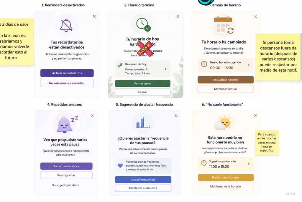
Reminders that adapt to each person's rhythm.
In the next Build Log, we’ll share what we ultimately prioritized, what we were able to build, which technologies we used, and how we’re trying to turn BRBito into an app that can actually make it to the App Store and Google Play.