
Ship-a-ton 2026: Build Log #4 - From Screens to a Real App
 on
on By this point in the Shipaton, we had a much more grounded idea of what BRBito should be. We knew how the onboarding should work, how we wanted to handle reminders, what Home should show, how someone could start a break, and what should happen when it ended.
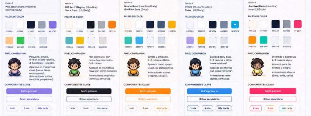
BRBito's identity began to take shape through characters, color and small details.
But when it comes time to actually build digital products, something that looks like a sequence of screens from the outside quickly turns into a collection of states, permissions, stored preferences, platform differences, bugs, and decisions about what should happen when things don’t go exactly as expected.
This time, we skipped the more traditional, detailed prototyping stage in Figma or Affinity that we had used in previous web and desktop projects. Many of the screens came from AI-generated visual concepts, Miro explorations, and more descriptive UI specifications covering what needed to appear, what content we needed, how a screen should behave, and so on.
That decision helped us explore and find ideas much faster, but it also meant that when development started, we didn’t necessarily have perfectly defined components, consistent measurements, documented variants, or a design system ready to implement. Many decisions that would normally be resolved before writing code ended up being made while we were building: An app isn’t only what appears on the screen. It also depends on the rules, data, and interface structure that make everything else work.
This stage has mostly been about turning the BRBito we imagined into the smallest BRBito we could actually ship.
What actually made it into v0.1
At first, we dreamed of launching the first version with multiple companions, accessories, different environments, more break families, more activities, and much deeper personalization. However, we realized that the core experience — and the one we needed for the first MVP — was much simpler:
Can someone configure BRBito, receive a reminder, take a short break, and return to their day without unnecessary friction?
To reach our Shipaton goal, we had to keep cutting features. We decided to prioritize onboarding, reminder preferences, local notifications, manual breaks, a timer, completion states, basic settings, and Spanish/English support. BRBito would start with one companion, one main environment, three break families, and one activity in each.
That might make the experience feel somewhat repetitive in the short term, but for us, making sure the core flow actually worked was more important than expanding the content library.
The hardest part wasn’t deciding what went on the screens
One of the biggest challenges we’ve had has been keeping the entire break lifecycle synchronized. We wanted people to stay in control. They could receive a reminder, ignore it, open the app later, start a break manually, leave the app, come back, finish early, or change their reminder settings. And throughout all of that, BRBito had to remember what happened and show the right thing next. The challenge became keeping three things aligned:
what the person did → what BRBito stored → what BRBito shows
That sounds simple until the app is closed, reopened, sent to the background, or the notification schedule changes. And even when the logic is correct, getting each screen to actually behave and look the way we imagined took several rounds of implementation, testing, and adjustment. A screen could look clear in a visual exploration, but once we started building it, questions appeared that the prototype didn’t necessarily answer:
- What happens if the text takes up two more lines?
- What is the minimum size of this component?
- What happens if an option is disabled?
- How does it behave on a smaller screen?
- Which elements are actually reusable?
- What changes between states?
- What should be a component, and what should simply be content?
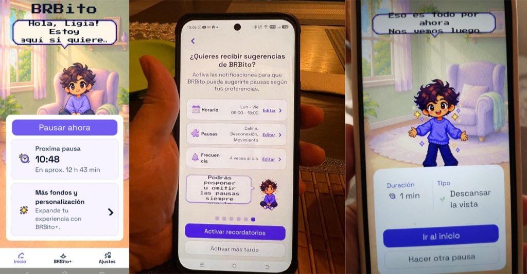
From the welcome screen to a break, each screen had to guide without interrupting.
We went from designing what a screen looked like to designing how a system behaved.
BRBito stores information locally
For this first version, we wanted BRBito to work without asking people to create an account. Keeping preferences on-device reduced onboarding friction, avoided unnecessary data collection, and allowed the core experience to work offline. It also saved us from having to build authentication, profiles, syncing, and backend infrastructure that weren’t essential to the MVP.
Using MMKV (Multi-Process Key-Value), BRBito stores preferences and break state directly on the device: language, name, active days, reminder schedule, frequency, preferred break types, and the current break state. When the app opens again, that information is restored before the interface appears, so the experience can continue without asking the person to configure everything again.
Reminders made BRBito feel real
We wanted BRBito to use local notifications based on the schedule each person chooses. We calculate reminder times, schedule them on the device, and update them if the user changes their days, hours, frequency, language, or notification preferences. We also considered integrating OneSignal for remote push notifications, but we realized it required more implementation and testing time than we had available. Since local notifications already covered the main flow, we decided to leave that integration for a future version.
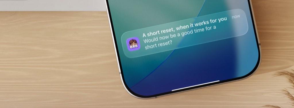
The reminder had to arrive at the right moment and feel like an invitation.
For Mike, seeing the first reminder arrive at the right time was one of those moments when BRBito stopped feeling like a collection of screens and started feeling like a real product.
For Gia, it was simply being able to open the app on her own phone after weeks of work and finally see all the pieces behaving the way they were supposed to.
One codebase, two platforms
We’re building BRBito with React Native and Expo, sharing most of the code between iOS and Android. And while having a shared codebase helps a lot, the final experience still needs platform-specific attention. We found differences in time pickers, keyboard behavior, spacing, icons, navigation controls, and notification permissions.
For the frontend in particular, one of the biggest challenges has been making the same composition feel clear across different phones. Images, spacing, cards, and buttons that looked right on one device sometimes needed adjustments on another.
Pixel art also created technical problems
Our original visual implementation duplicated some backgrounds and interface elements across screens, which made the app heavier and harder to maintain.
Changing the architecture so the background and companion became separate layers allowed us to reuse environments while changing the character sprite independently.
That gave us much more flexibility for different poses, environments, and future personalization without rebuilding entire scenes.
Another one of our most useful bugs came from typography. The pixel-style font looked good on iPhone, but on smaller Android screens — especially with larger accessibility text settings — some messages no longer fit inside their speech bubbles. That forced us to rethink both the font and the flexibility of the component, reinforcing an important idea:
A visual decision isn’t finished when it looks right in a prototype. It has to survive real content, real devices, and real settings.
In our case, that was even more obvious because many of those prototypes had never reached the level of detail of a complete design system. We didn’t have time to define every token, variant, or component before development started, so several visual rules ended up being consolidated during implementation. It may not have been the ideal process, but it was a direct consequence of building under Shipaton constraints.
The stack behind BRBito
Our current stack is relatively small:
- React Native + Expo — iOS and Android from a shared codebase
- Expo Router — navigation
- TypeScript — safer integration between data and components
- MMKV — local preferences and break state
- Expo Notifications — local reminders
- i18next — Spanish and English
- Firebase — analytics, diagnostics, and errors
We’re also integrating RevenueCat, but we’ll talk about monetization in our next Build Log.
Having the app working is different from being ready to ship
Another surprise was realizing how much work exists beyond actually programming the app. App Store Connect and Play Console required descriptions, screenshots, privacy information, support pages, release configuration, testing, and other store-specific materials.
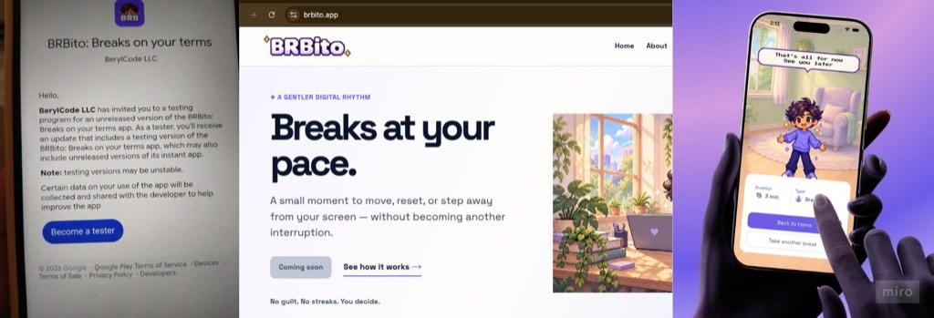
BRBito moved from screens into the hands of its first users.
For our Android publishing process, we also had to account for a fourteen-day testing period with twelve testers. On iOS, we submitted an early build and went through several review attempts.
If we started again
-
We would spend more time upfront on reusable interface architecture and keep store review timelines in mind from day one.
-
We would also separate rules, data, screens, and assets more clearly to make future iterations easier, while protecting implementation time more carefully.
-
Research, design, development, content, marketing, and Build in Public were all happening at the same time. That gave us a much more complete product-building experience, but it also meant all of those things were competing for the same six weeks.
BRBito still isn’t really “finished,” but its core loop now exists outside Miro. It remembers preferences, schedules reminders, can recover an active break, and increasingly behaves like the companion we imagined at the beginning rather than a collection of screens.
At the moment, we’re integrating RevenueCat and experimenting with a small layer of paid visual customization, while also making some interesting decisions about what should always stay free — which we’ll talk about in our next Build Log.